graphic designer uae
logo design , banner design,business card designgraphic designer uae
logo design , banner design,business card designLogo Translations for Small Screen by H.I.T. Students

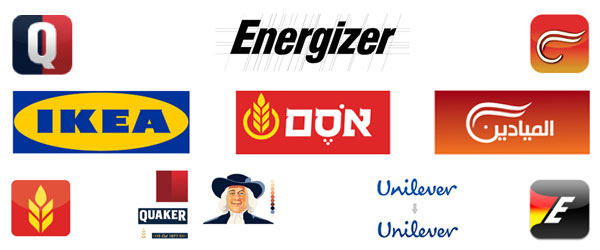
Not all logos are responsive enough to be compatible with small screen or other applications. For larger logos, an alternative version is needed which could be displayed on other smaller applications. Such a project was assigned to the students at Oded Ezer’s Typography for Interaction Design class at Holon Institute of Technology (H.I.T.), Visual Communication Department, in Israel.
They were given a design brief: “Re-design a screen compatible version for a known print-based logo (such as App launcher icon, logo for splash screen, favicon, etc.). Define and keep in mind the core values of the brand, and the technical requirements for the adjustment to screen.”
While checking out their work, please understand that these are not redesigns of famous logos. These are merely translations of logos by maintaining the essence and main elements for small size. This is not client work either. It was done by students as a university assignment.
Related: 5 Famous Brands that Peeled off their Logos in 2013
Logo Translation #1
Quaker
Student: Erica Rotberg
Brand: Quaker
Core values of the brand: Reliability & stability.
Quaker
Quaker
Steps Taken:
• Facial features of the figure have been redrawn for a modern and fresh look.
• Improved readability achieved by separation of logotype from the drawing and enlargement of inner letter space.
• Application Icon design encapsulates the logo by using the brand name’s initial. The color palette and division are also the same.
Logo Translation #2
Unilever
Student: Ma’ayan Kara-Oz
Brand: Unilever
Core values of the brand: Versatility & friendliness.
Unilever
Unilever
Steps Taken:
• Improved readability achieved through correction of letterforms, inner letter space enlargement, and color adjustment.
• Icon separation from the original logo – used as a part of the animated new logo.
• Logotype remains static with the alternating icons.
Logo Translation #3
Osem
Student: Elad Nayder
Brand: Osem
Core values of the brand: Authoritative and of the people.
Osem
Osem
Steps Taken:
• Improved readability through correction of letterforms.
• Selective use of color, simpler frame and less slanted letterforms.
• Application icon design encapsulates the logo by using formal elements and the new brand colors.
Logo Translation #4
AlMayadeen
Student: Ortal Yahud
Brand: Al Mayadeen
Core values of the brand: Modern, dynamic, and authoritative.
AlMayadeen
AlMayadeen
Steps Taken:
• New minimalistic logo created by joining modern logotype with calligraphic arabesque.
• Coloring adjustments.
• App icon design and Favicon based on newly created graphic element.
Logo Translation #5
Energizer
Student: Anat Kenig
Brand: Energizer
Core values of the brand: Fluid & reliable
Energizer
Energizer
Steps Taken:
• A dynamic shape created with the help of selective colors.
• Correction of letterforms, enlargement of inner letter spaces, and tilted general shape.
• App icon and splash screen encapsulate the logo using the new logo elements and brand colors.
Logo Translation #6
Ikea
Student: Ilya Katz
Brand: IKEA
Core values of the brand: Accessible, reliable, and global
Ikea
Ikea
Steps Taken:
• Design is modern and simple.
• Improved readability of the logo type and colors.
• App icon and web Favicon created from the new formal.
How do you like the creativity and critical thinking involved in the making of this project? Do you think it’s important to have a small screen adaptive icon for every logo? Please, leave your thoughts in the comments below.
source : https://www.designmantic.com/blog/logo-translations-for-small-screen/