graphic designer uae
logo design , banner design,business card designgraphic designer uae
logo design , banner design,business card design20 Funny Honest Logos of Famous Brands
Commercial branding strategies reflect the foresight and worth of a brand. They earn it a perpetual recognition in the customers’ minds. It is important for a logo to reflect the true essence and message of a brand because that is what the customers begin to expect from it.
Yet most of the time, we find brands that do not live up to their claims. These are multinational companies which have millions of customers around the globe. Every passing day makes it easier to recognize the dishonest approach of these commercial firms who only focus and exaggerate on the positives.
Guess the Famous Logos – A Logo Quiz!

Logos Telling News – More than just a symbol!

Color Spectrum of Famous Logos – A Logo Color Story!
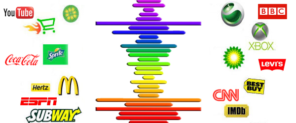
First, as a consumer; second, as a designer; I couldn’t help but notice how so many of my favorite brands are using similar color palettes for their logos. If one logo becomes a hit in an industry, other emerging brands follow suit and use similar elements of design.
Logo Translations for Small Screen by H.I.T. Students
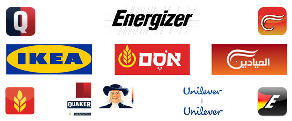
Not all logos are responsive enough to be compatible with small screen or other applications. For larger logos, an alternative version is needed which could be displayed on other smaller applications. Such a project was assigned to the students at Oded Ezer’s Typography for Interaction Design class at Holon Institute of Technology (H.I.T.), Visual Communication Department, in Israel.
They were given a design brief: “Re-design a screen compatible version for a known print-based logo (such as App launcher icon, logo for splash screen, favicon, etc.). Define and keep in mind the core values of the brand, and the technical requirements for the adjustment to screen.”
While checking out their work, please understand that these are not redesigns of famous logos. These are merely translations of logos by maintaining the essence and main elements for small size. This is not client work either. It was done by students as a university assignment.
Related: 5 Famous Brands that Peeled off their Logos in 2013